
We've touched on this slightly before, however it's a subject that's cropping up A LOT lately (maybe you lot are all spring cleaning?!)
So this post (bear with me) is gonna go a little more in-depth into how we create sophisticated colour palettes. No more waffle, let's get straight to it...
1.
ATMOSPHERE
Rather than a specific look, I would always advise to start a space by thinking about how you want it to feel or the atmosphere you want to create in there.
If you initially shoe horn your ideas into a look you’ve seen elsewhere, your space will lack personality and you’ll limit your creative freedom.
(REMAIN OPEN MINDED AT THIS STAGE)
Instead,
start by brainstorming words and feelings, then develop this by looking into colours that you associate with those feelings.
For example...
dark tones will add drama, layering tone on tone of muted neutrals will create a calm space, where pops of bright will create uplifting vibes, and bright worked against dark can create an edgy, modern look.
2.
FROM THE HEART
Our biggest piece of advice is work from the heart. If you do this across the board, from choosing colours and buying individual pieces, you can’t go far wrong. We often say to shoppers if you “shop what you love” rather than what you’ve seen or what you think you should love, there will be a reason behind all of those choices. Something that links it all together- meaning when you work it together in a space, it will create your own personal delight!
This is why you don’t need to concentrate on a specific look before you start.
3.
DITCH THE 'EARLY DOORS' PAINT SAMPLE BUYING
Many people ask us about paint colours and how to pick when starting to decorate a room.
My advice, start small.
Once you’ve figured out how you want your space to feel, ditch the paint sample buying in the early days- this will just confuse you and will result in bland spaces.
It’s about forgetting buying paint first and thinking up a scheme to fit around it second. Its easier and more complex to do things the other way around – this is where we start thinking like designers.

A very good friend ( Name beginning with J and ending with Di'Niro :P ) said to me recently, " I just need to pick a paint colour first then I'll..." and I stopped her mid sentence with "NOOOOO". Thinking big scale like this initially will limit your colour palette. Start small...
4.
FIND A PIECE YOU LOVE & MILK IT
Start with one item you love, whether that may be a piece of artwork, a cushion, a poster, a record cover, a lampshade, a photograph, a vase – absolutely anything.
Then its time to start thinking about ratios…
5.
'CONSIDER' THE RATIO RULE
We don’t do usually do rules, but ‘considering’ ratios when working a colour palette will give you the confidence to really start to play with colour.
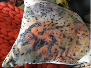
We urge you to go for something containing at least 3 or 4 different colours...we’re going to create a palette based on these colours, used around the rule of
60:30:10

The way you use the ratio of colour will change up the entire look and feel of the room. For example here you can see three colours plucked from our favourite cushion used in 2 different ratios…this is completely up to you.
6.
THE 60%ER
Pull out the colour you love the most – this will be your 60%, the hue that brings everything together. You’ll paint your walls out in this, perhaps your floors and ceilings too if you’re brave enough.
At LD we veer towards darker walls and accessorising with lighter shades and elements of colour (We call this look The LillianDaph - more to be revealed in due course).
We’ve learnt that not only does this give everything put in the space more opulence (by making them POP against the darker hue) but it creates the illusion of infinity too by losing the break in colour between the dark and light.

Instead, play your spaces quirks to your advantage and create spaces that are personal to you.

Image of our living room by www.beautifulhomesinthenorth.co.uk
If you’re like us however, and love to have a more classic take on dark and can’t quite part with your lighter ceiling shade, the trick then is to pepper in the same light shade throughout the space to tie it all together seamlessly.
(e.g white ceiling + white windows + dark wall's= white accessories)
7.
THE STATEMENTS i.e THE 30%er's

Image of our living room by www.beautifulhomesinthenorth.co.uk
Your big statement pieces like your sofa, chairs and rugs make up your 30% and will all be colours that compliment and work alongside you 60%er, but that add something of their own too.
If you worked loads of colours all in the same ratio it would feel too chaotic and uneasy on the eye. So just because your 30% is not as prominent as your 60% colour, it doesn’t mean it has to be calmer or downplayed-it actually could be louder or brighter. But what it does mean is that you will create a cohesive and connected palette. This is the beauty of considering ratios when it comes to colour.
Don’t forget with regards to the ratio rule we are talking hues, not tone. So once you’ve selected your hue make sure you layer on the tone for maximum interest. Matchy-matchy spaces can come across as uptight and boring, as well as lack personality, ahem...

Pinterest.com
To keep it interesting and to create depth and warmth, layer the tones of the colours in your palette. This is how you can create really complex and interesting palettes with even the most subdued and muted tones, like greys and taupes.
With most light spaces, this element is forgotten, making neutrals seem bland when actually, when done correctly, they can create some of the most sophisticated spaces.
I really bang on about layering tones but HONESTLY it is a small act with a BIG result.
Don't MATCH your grey carpet with the same tone grey sofa for goodness sake, who wants to look at all the same god damn grey?!?
Mix it up - I promise you'll forgive me for getting aggressive!!!
Here you can see varying tones of the initial hues we picked, and how we have made the ratios up of varying tones of our chosen hue. So you can see you don’t have to stick to 3 colours alone, it keeps it interesting and more complex to layer up.
8.
HAVE FUN - the 10%ERS
What we think of as the fun part, the 10%ers account for your cushions, throws, vessels and finishing touches. The accents that can completely transform the space, make it unlike anyone else’s or any page in a brochure. (I'm really working on this at the minute in our own home and this post is making me want to rob my own store)

These elements are best built over time and not rushed, your collection will grow and change as you and your interior style does. And that’s cool- so embrace it.
When I think back to our first home it makes me cringe!

Our living room pre- LD!
It is exciting to look back and see how spaces evolve as your confidence grows though.
9. EMBRACE TWEAKS
LOT's of us (my previous self included) paint walls out in light hues then add 'POPs' of colour.
BLAH. BLAH. BLAH (I'm getting brave now aren't I!)
Now I'm not sure if the main reason we do this is because
a) we're scared we won't like the wall colour once it's done,
or b)
maybe it's because we think we might get sick of the wall colour...
SURELY
if either of those things do happen, it would be much cheaper and easier to CHANGE the wall colour than the expensive pink sofa you bought?!?
Do you get the gist here?
I'm not saying don't buy a pink sofa.
If you love it, BUY IT.
What I am saying is don't put it next to a white wall. How about trying a toxic shade of green or the deepest soft brown? Then see just how AMAZE BALLS that pink sofa looks.
Your white walls aren't the most flattering or exciting foundation for your COOL, EXPENSIVE collectables - trust me, I'm a convert.
Your pieces should be your investment, and your wall colours should enhance them to the MAX!

https://www.fentonandfenton.com.au/
Changing up your 60% will never mean you need to change your 30 and 10%ers. Just as changing up your 10% will never mean you need to rethink your entire 60 and 30% hues, it will just mean you may need to distribute some of the new 10% evenly around the space.
At home, we like to accessorise our spaces with similar hues. The beauty of this is that we can very easily switch things up by moving from room to room. This also helps cohesion within the whole home. So although the 60 and 30%ers we use are very different in each room, generally. our kitchen, bathroom, hallway,
bedroom and living room are all finished with 10%ers of a certain hue.
Images all of our home courtesy of •http://beautifulhomesnorth.co.uk/
Of course this isn’t a necessity, it is how I'm currently rocking and how we get personal. You might like to add bright pops, metallic or
pastel finishes or each of these in a different space.
10.
DON'T STOP THERE
Once you’ve got to grips with colour, you must then overdose on the
'3 finishers'
TEXTURE, PATTERN & SCALE
These elements will elevate your spaces to the next level- we’re talking magazine worthy. It will bring everything together and create the most amazing visual excitement, creating what we call
‘the second glance effect’.
This is what makes spaces intriguing and stimulating. Your guests won’t know where to look and will feel intrigued at the mash up of finishes, and multitude of layers. It will make you and your guests linger longer.
This effect is at the heart of LD interiors.
Your home should be an escape from the everyday routine and long working days.
It should encourage you to take time for you and most of all provide comfort and familiarity.
ROUND UP
To round it up, we have only touched on bringing the whole thing together here, there are many finishing tricks to consider once you’ve found the confidence to start creating your own colour palettes. As much as getting the base right is important, it is how you work it that really makes a space.
More post's on the '3 Finishers' to come, but for now remember
Colour is transformative.
There are no right or wrong.
Any colour can look amazing if worked in this way then finished correctly.
Over and out Palette-istas ;)
Christina
XOXO